You have 0 items in your cart
The first place I always start when I’m designing a room or choosing a paint colour is…
How do you want the room to feel?
Once we know how we want to room to feel, we can start choosing colours and materials that reflect that mood and create the desired feeling. And colour psychology is a big part of this. It’s the perceived effect that colour has on our behaviour and emotions.
And while colour psychology can be very personal and relate to each individual’s culture, age and gender, there are some more widely applied theories that can be really useful when it comes to decorating your home.
Colour psychology for when you are decorating
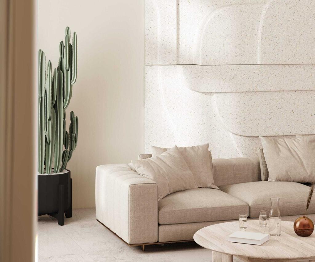
Warm Neutrals
This gorgeous group of muted shades are derived from warm colours on the spectrum such as yellow, orange and red. Examples include beige, taupe, grey and cream. Try any of these colours if you are looking to achieve the following feels…
Warm – Timeless – Cosy – Earthy – Comforting.
Colour psychology for when you are decorating
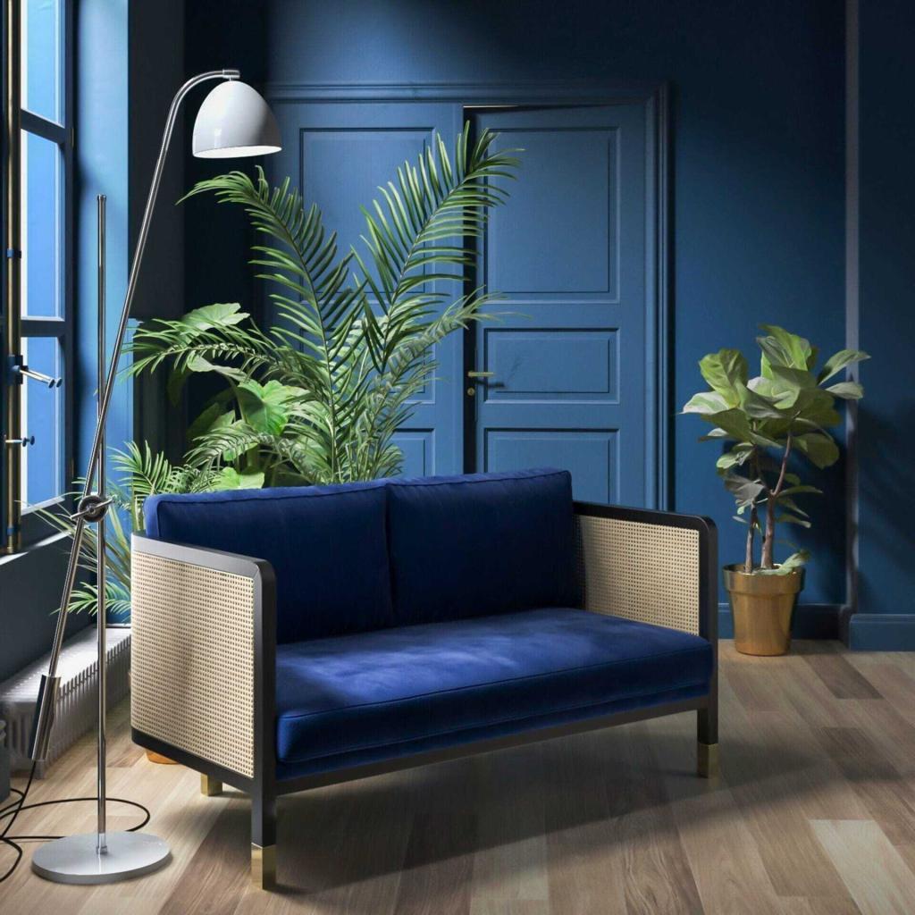
Blues
Associated with feelings of security, stability, comfort and calmness as it reminds us of blue skies and calm seas. Perfect for living rooms, snugs, teenager’s bedrooms, or any room where you spend time on your own.
Cool – Airy – Relaxing – Calming – Restful.
Colour psychology for when you are decorating
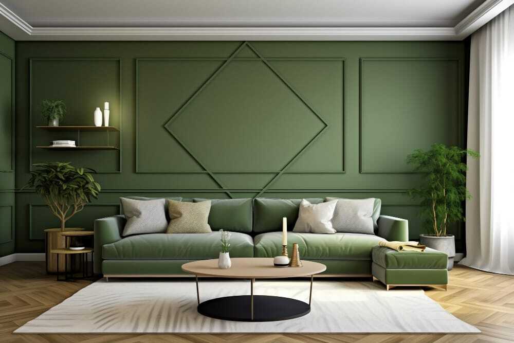
Greens
Associated with feelings of balance, growth, health and fertility. This colour combines the calmness of blue and the optimism of yellow making it a really positive colour that can work in any space. It’s an easy colour to live with so wrap it around your walls.
Nurturing – Balancing – Focused – Motivating.
Colour psychology for when you are decorating
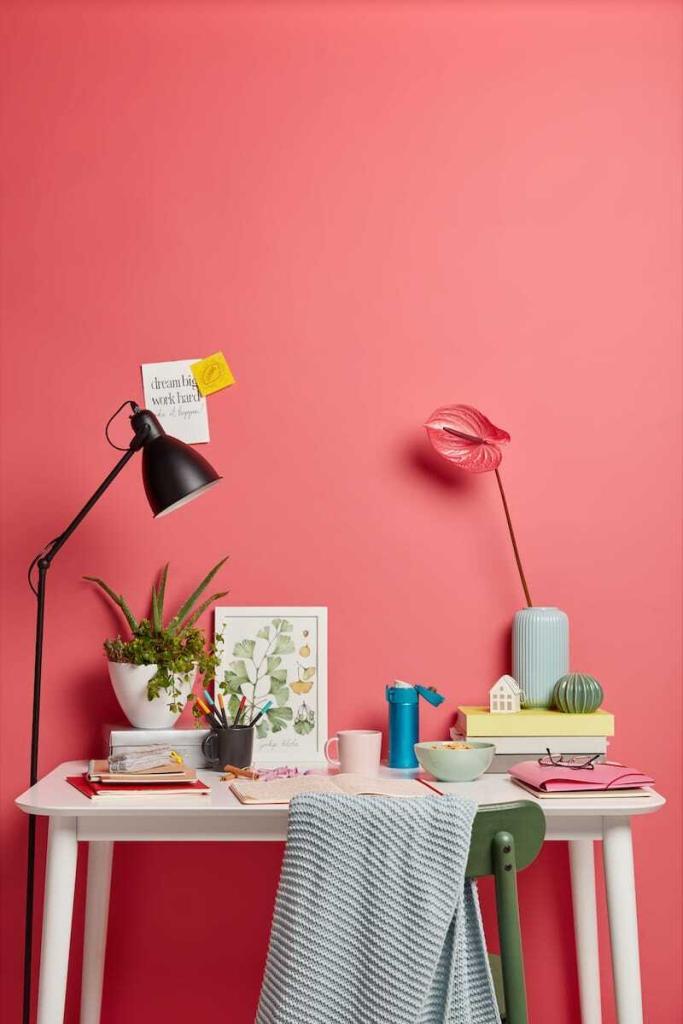
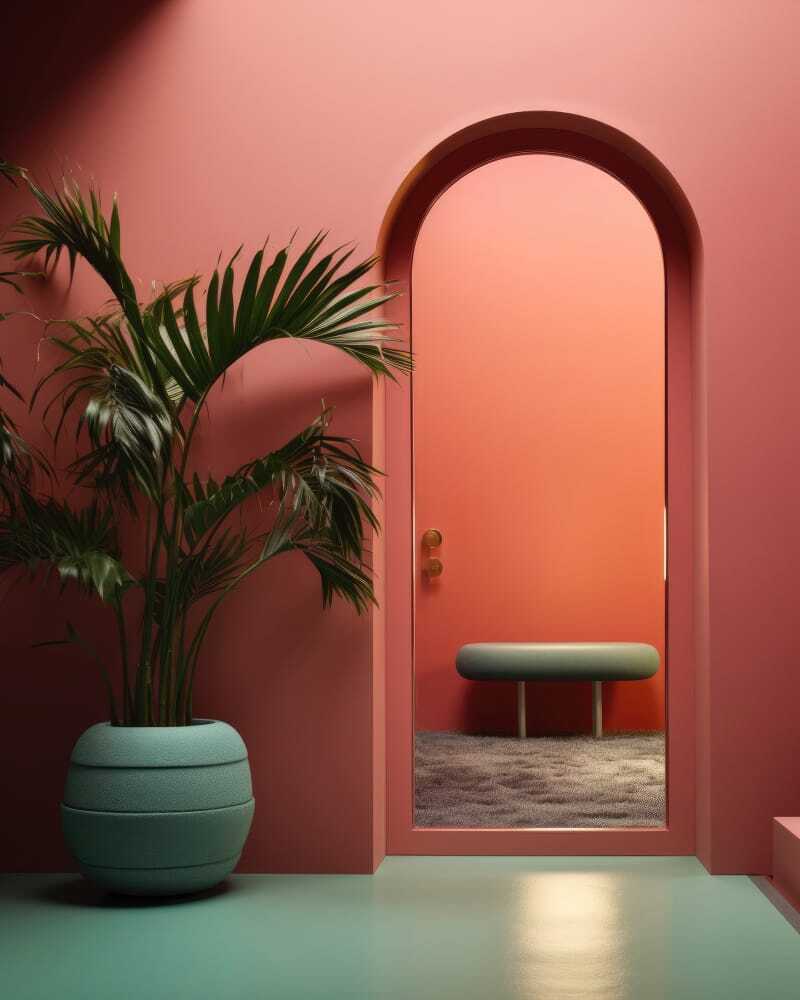
Pinks
From soft plaster blush to full-on Barbie-core, pink is such a versatile colour. Thanks to its strong association with feminity, pink evokes feelings of reassurance and comfort and has even been proven to reduce anger and aggression. Use soft pinks in spaces where you want to bring a sense of calm and poise such as a bedroom or a workspace. Try more punchy pinks in sociable spaces.
Soft – Warm – Playful – Grounding – Calming.
Colour psychology for when you are decorating
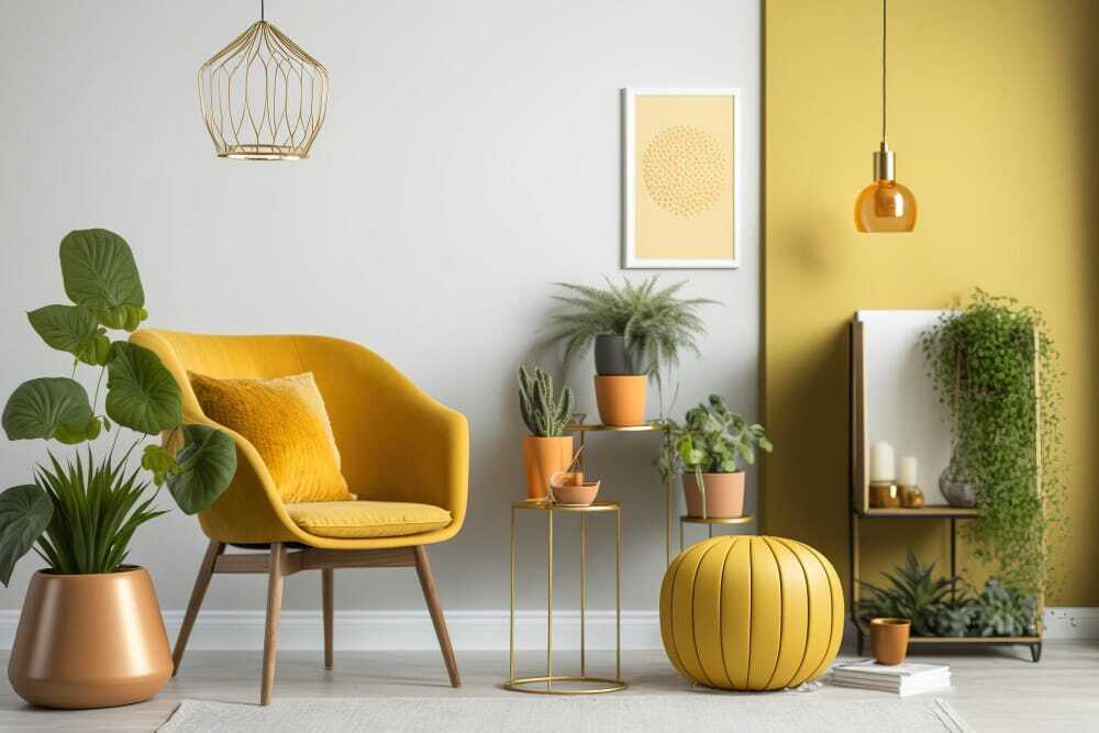
Yellows
Associated with feelings of warmth, optimism and positivity. Interestingly it is one of the most divisive colours and rarely used in public spaces. It’s thought to create a sense of anxiety and agitation when used in large spaces so, if you’re not sure about it, use it as an accent.
Warm – Upeat – Positive – Cheery.
Colour psychology for when you are decorating
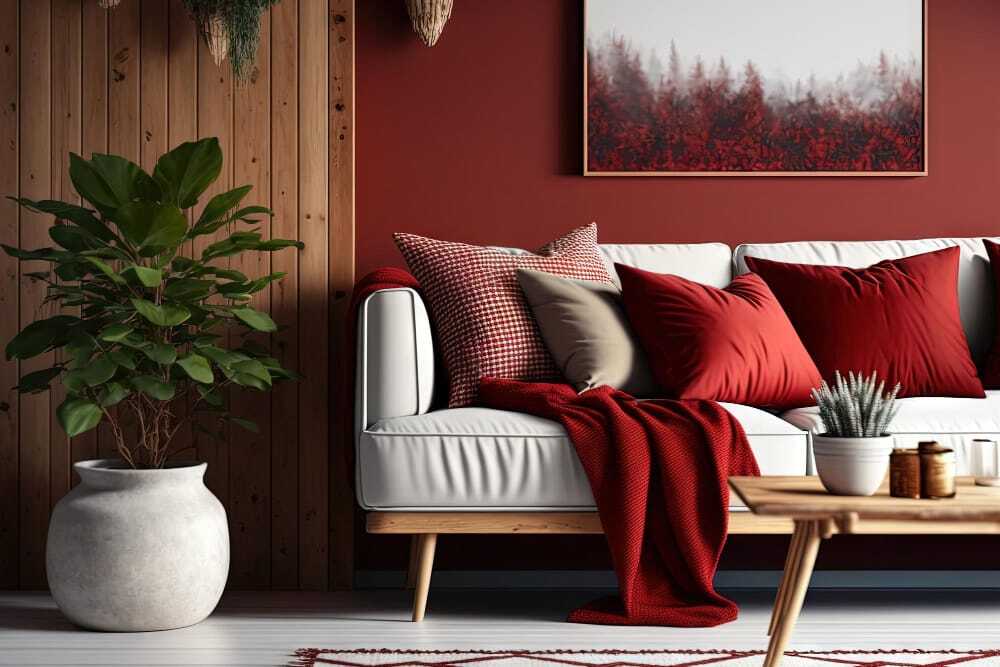
Reds
Associated with feelings of passion, strength, excitement and energy. Great for using in kitchens, dining rooms and the home office. It’s believed to increase our heart rate and appetite, so avoid it in areas where you rest or sleep!
Rich – Energising – Warm – Sociable – Bold.
Colour psychology for when you are decorating
Summary
Colour psychology is a widely studied field, but the most important consideration of the effect of a colour is the effect it has on you. We can all interpret colours differently. Some will find a muted green soothing and relaxing while others may find it dull and drab. We’re all different!
How can I help you?
If you are struggling with choosing colours you would probably find my Design Surgery very useful. It’s a ninety-minute online interior design consultation where we can discuss colour palette options for your home, and any other interior design dilemmas you have going on in your life right now.
And if you are tackling the redecoration of multiple rooms in your home right now then take a look at our best-selling home renovation planner 😀. It’s the perfect tool for creating your room designs and managing your project.
Let me know if you have any questions in the comments below.
Happy decorating,
Sarah x